20 Apr Memorabilia: signs of American car brands
FMM Assistant Curator Cheslynne Ruiters takes a look at the stories behind some of items in FMM’s collection of memorabilia and artefacts. This month he takes a brief look at the workshop signs of two American car brands…
Distinctive badges or logos are an important means of identifying a product which people can readily recognise. They can attract attention in a number of ways such as size, shape, script, colour, and are designed and positioned to be noticed.
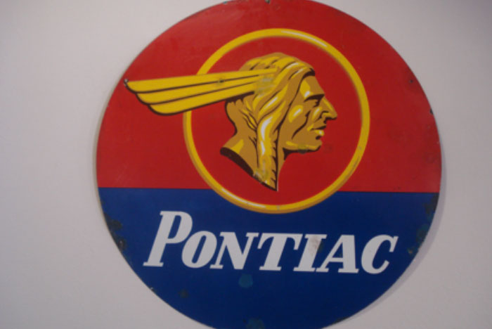
Pontiac was a product name revived and introduced by General Motors in 1926 to fit between entry-level Chevrolet and Oldsmobile. In this role it took over from Oakland, which in turn had evolved from the pre-GM Pontiac Buggy Company of 1907. The Indian head logo was adopted and remained in use until 1957. Pontiac was the Chief of the Ottawa Indians and leader of the Indian Rebellion of 1763-4, and his profile became synonymous with the ‘Chief of the Sixes’ branding.
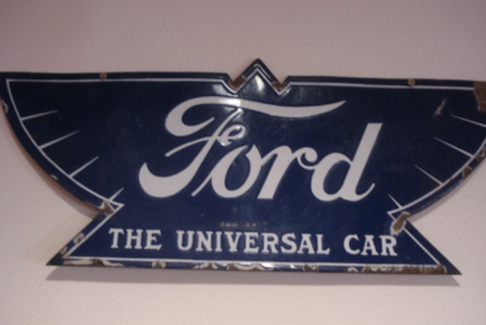
The Ford sign is a bit of a rarity. In 1912 the familiar blue oval made way for a new ‘winged triangle’ design. Introduced to symbolise speed, light weight, stability and grace, the design came out in either dark blue and featured ‘The Universal Car’ wording at the bottom. However, it did not last long as Henry Ford disliked the emblem. Instead, Ford has been reliant on an oval-shaped logo for most of its history. It looks simple and elegant, and has become one of the most recognisable badges in the world.